Rebrand Concept
NEXT CARE URGENT CARE
Next Care is a walk-in urgent care provider that offers affordable and high-quality care. They aim to treat their patients with sincerity, respect and compassion. Like all good health care specialist, Next Care wants their patients to feel safe, seen and well taken care of.
SERVICES:
UX/UI Design, Brand Identity, Logo Design
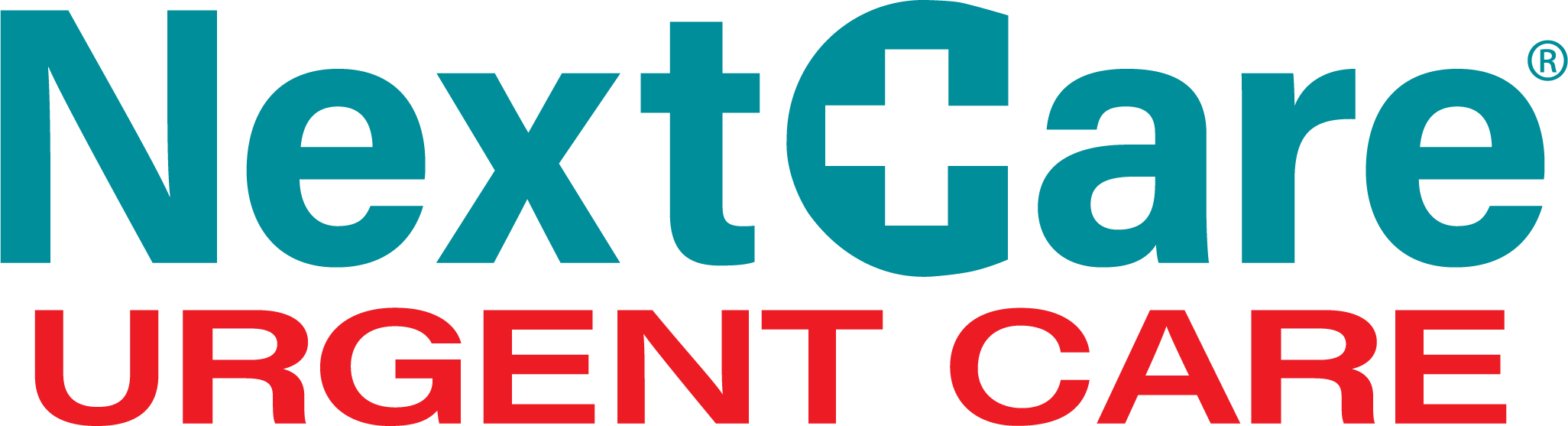
OLD LOGO
Problem
Logo isn’t memorable. Brand image doesn’t reflect brand values. Overall brand image is outdated
Challenge
Create an impactful logo.
Communicate brand values.
Modernize the brand image.
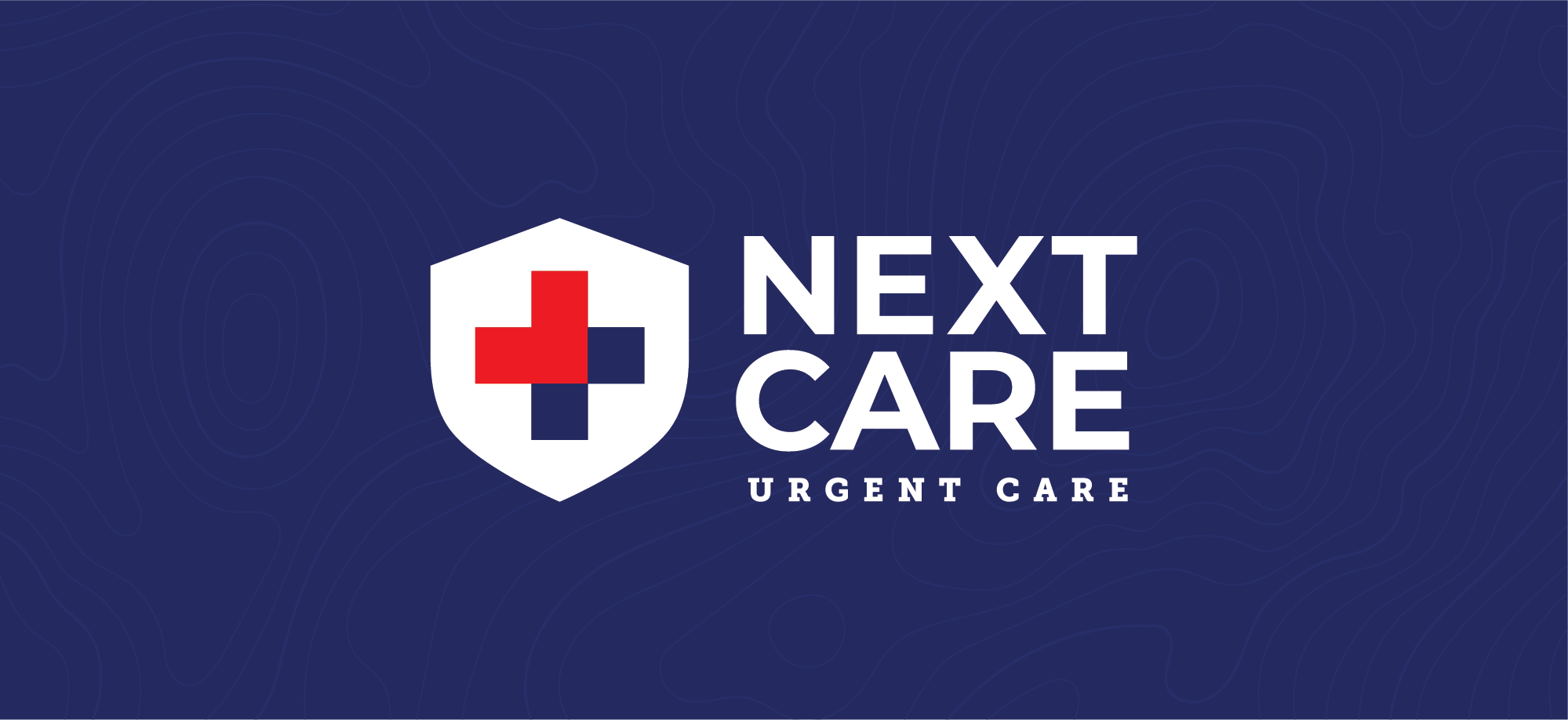
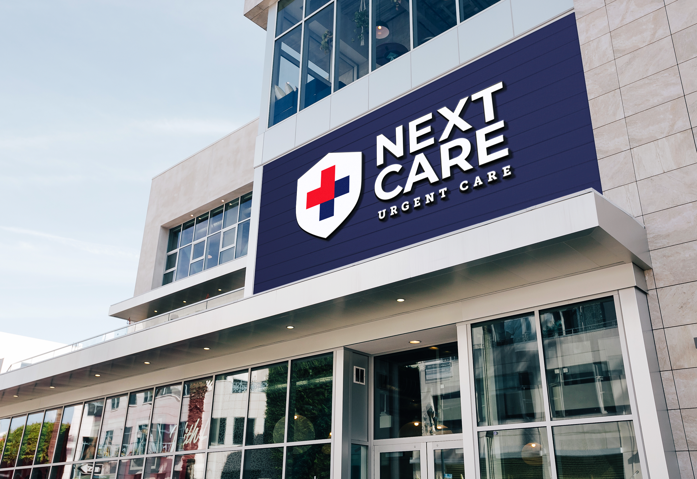
NEW BRAND IMAGE
APP DESIGN
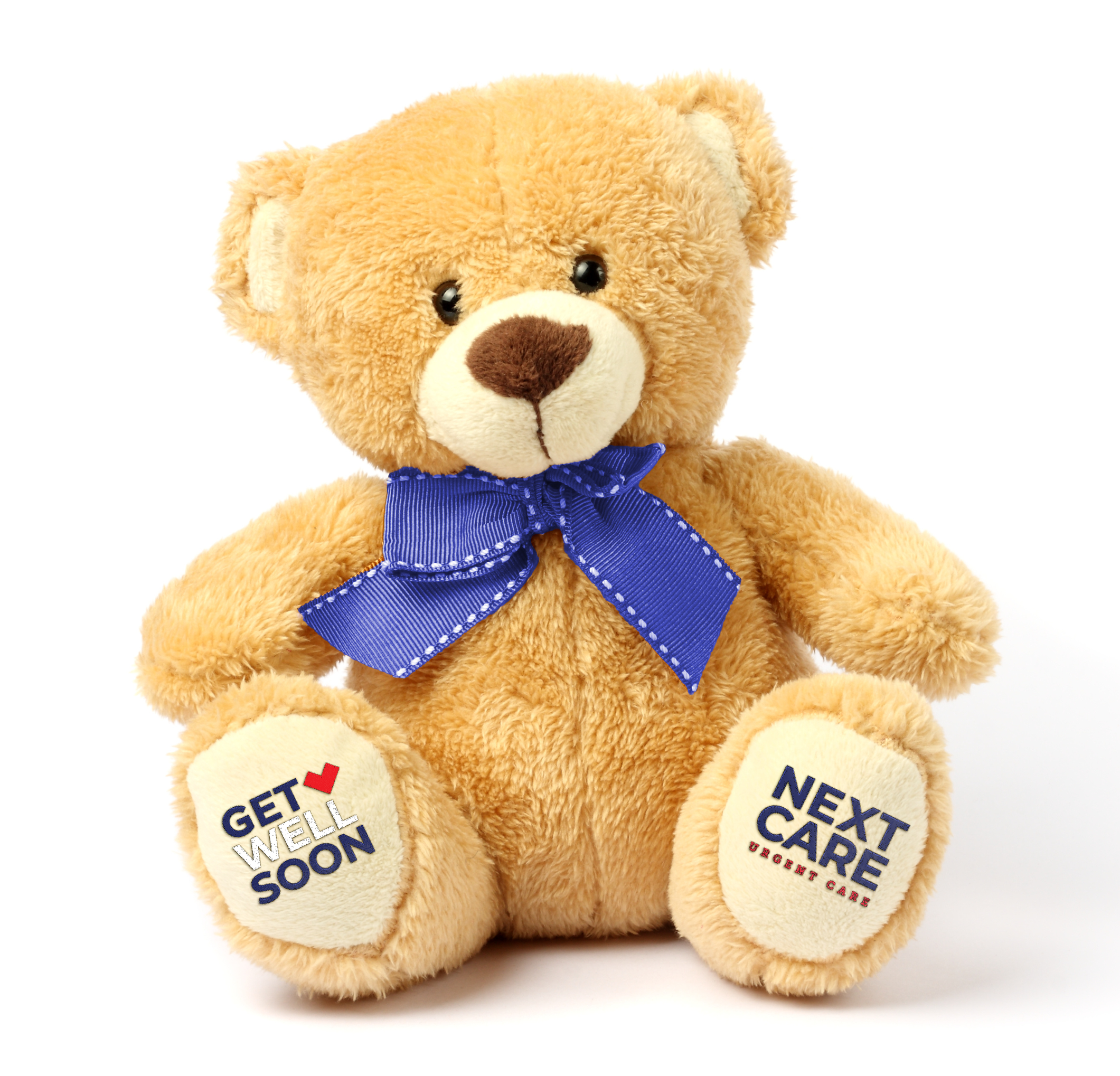
BRANDING
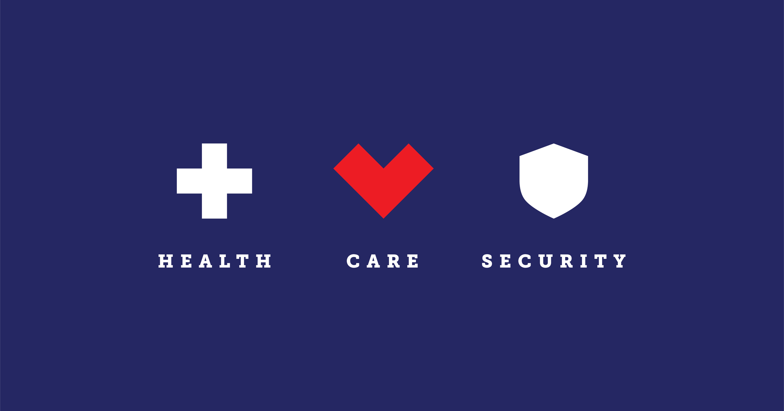
Rationale
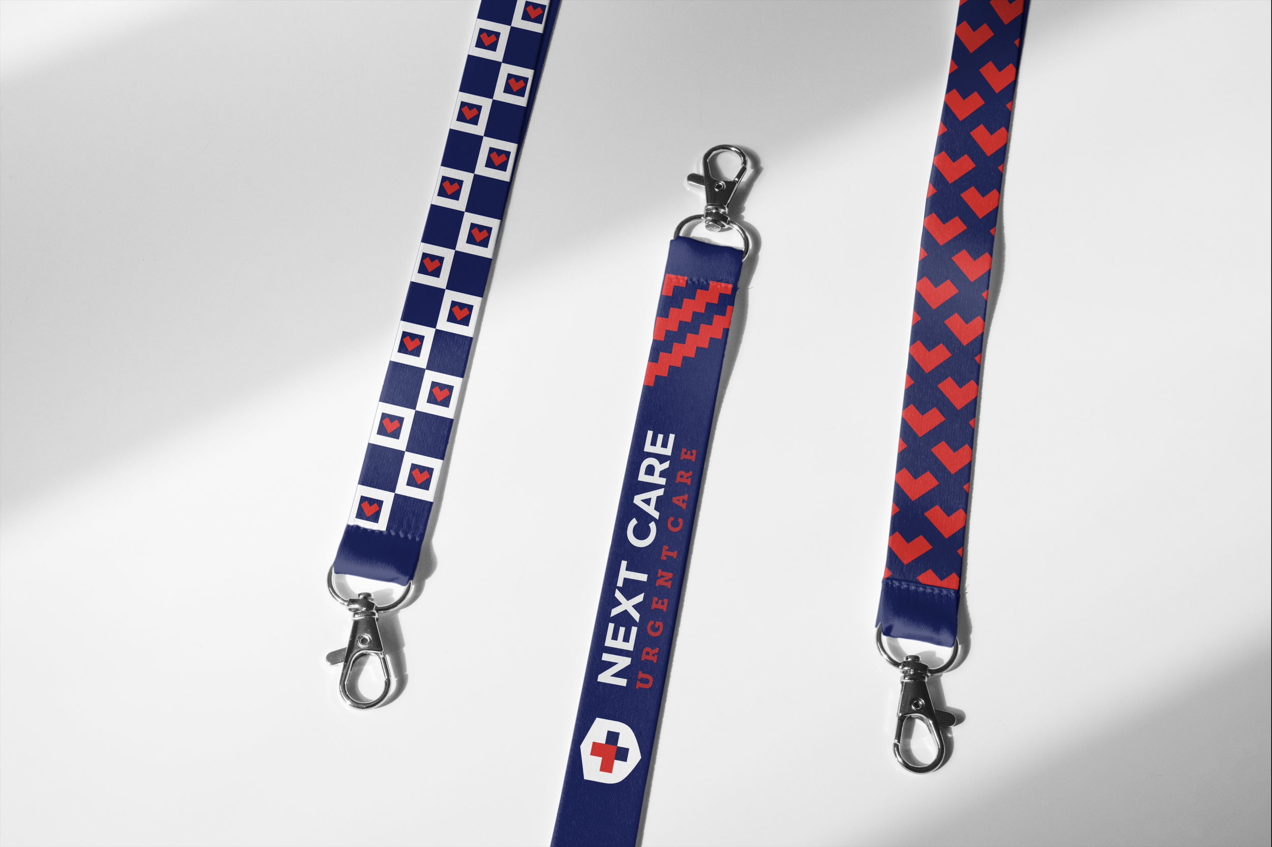
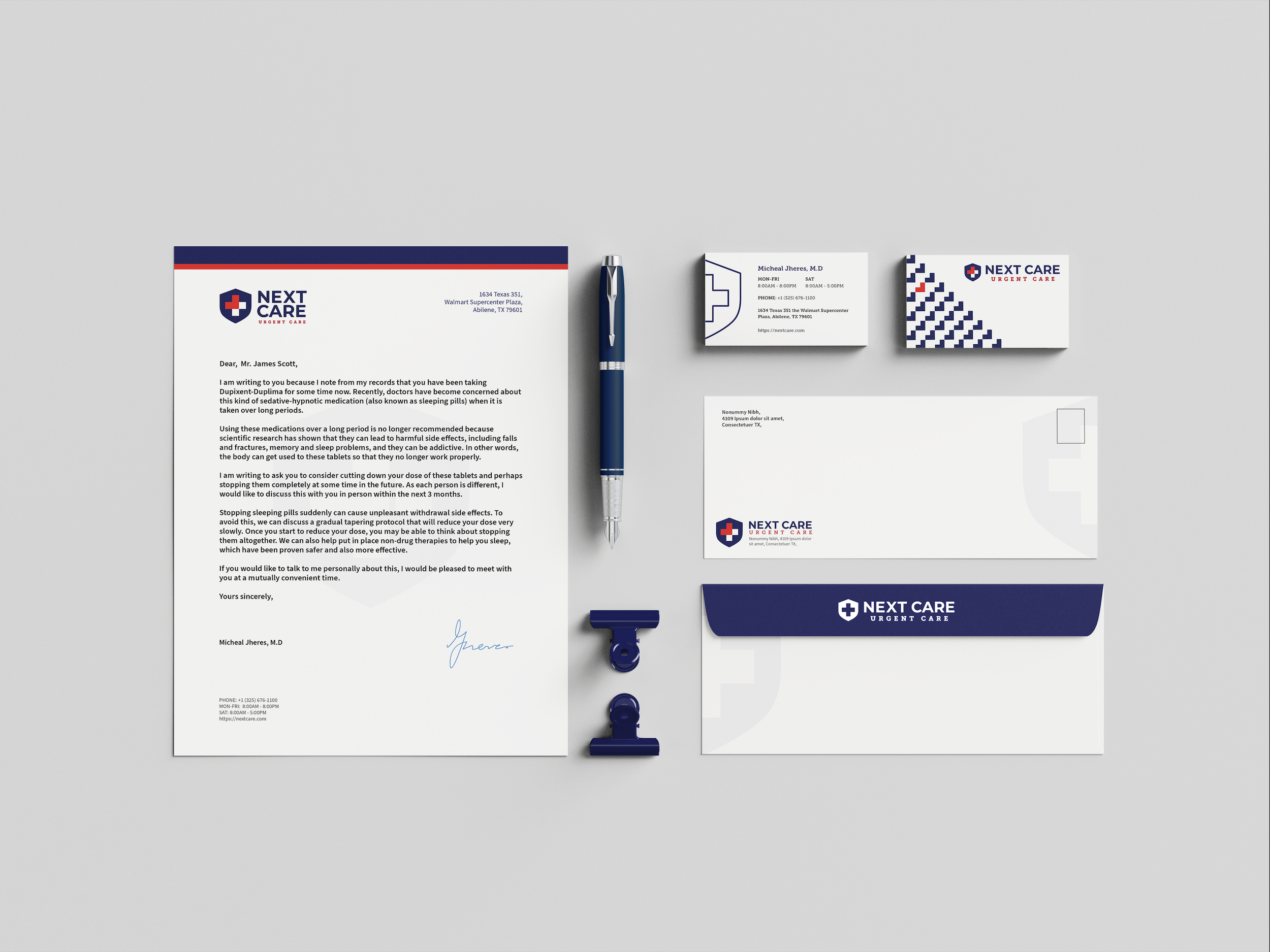
Keeping in mind the brand values of health, care, and security, the new logo was designed to reflect those 3 qualities. By combining geometric icons with colors that are commonly associated with health and protection, the logo directly communicates who the brand is in a clean, modern setting.
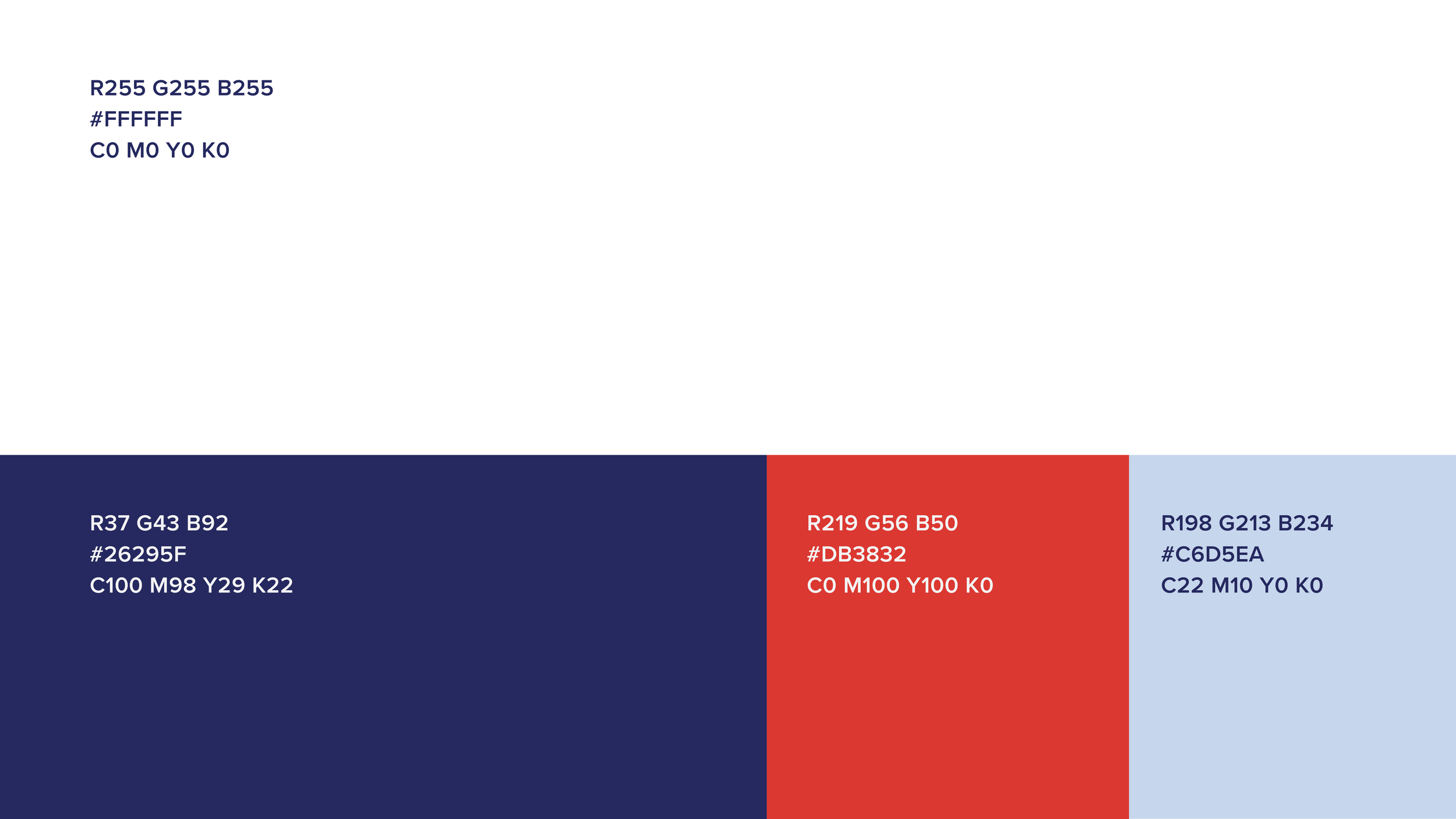
Color Palette
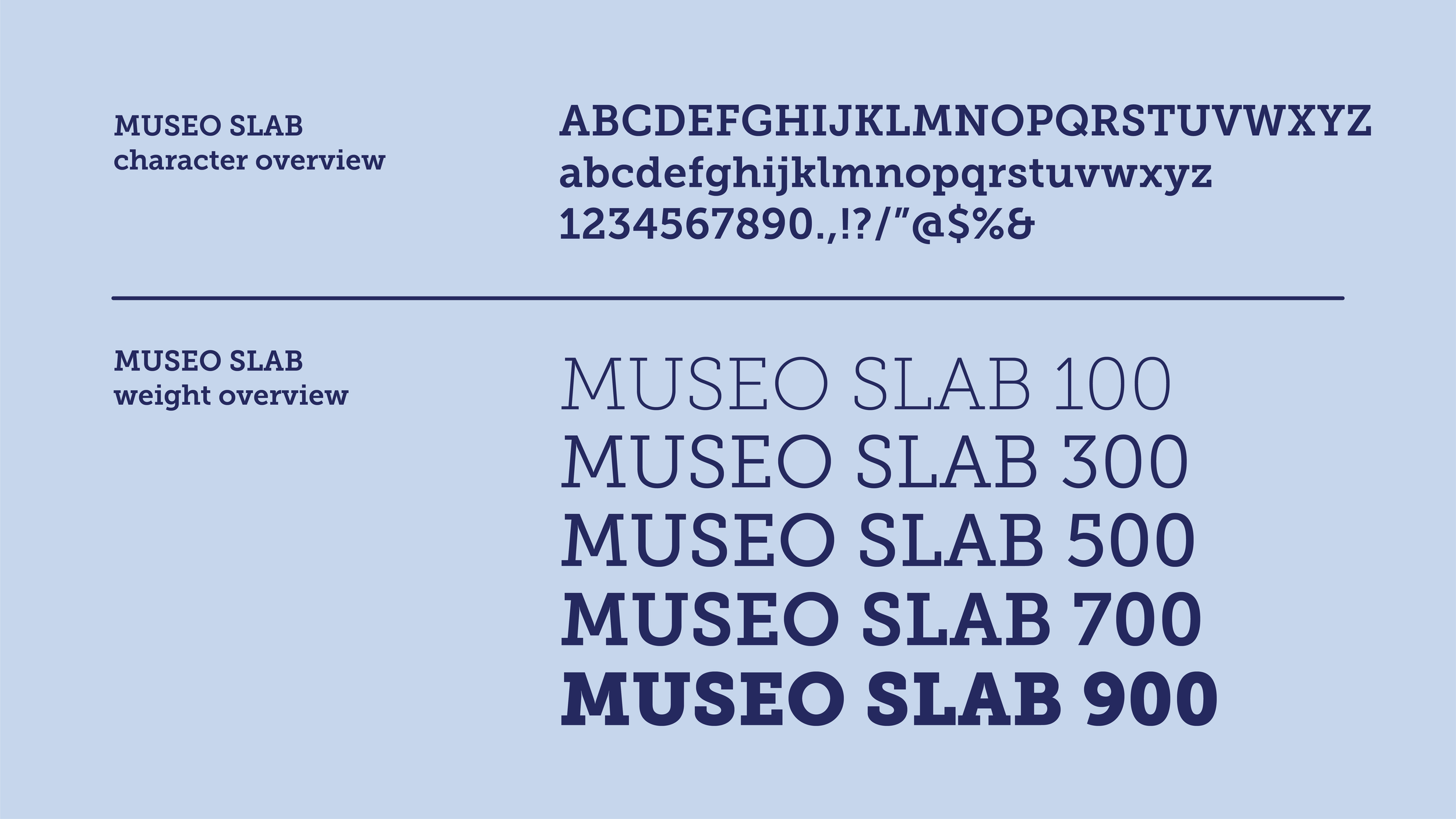
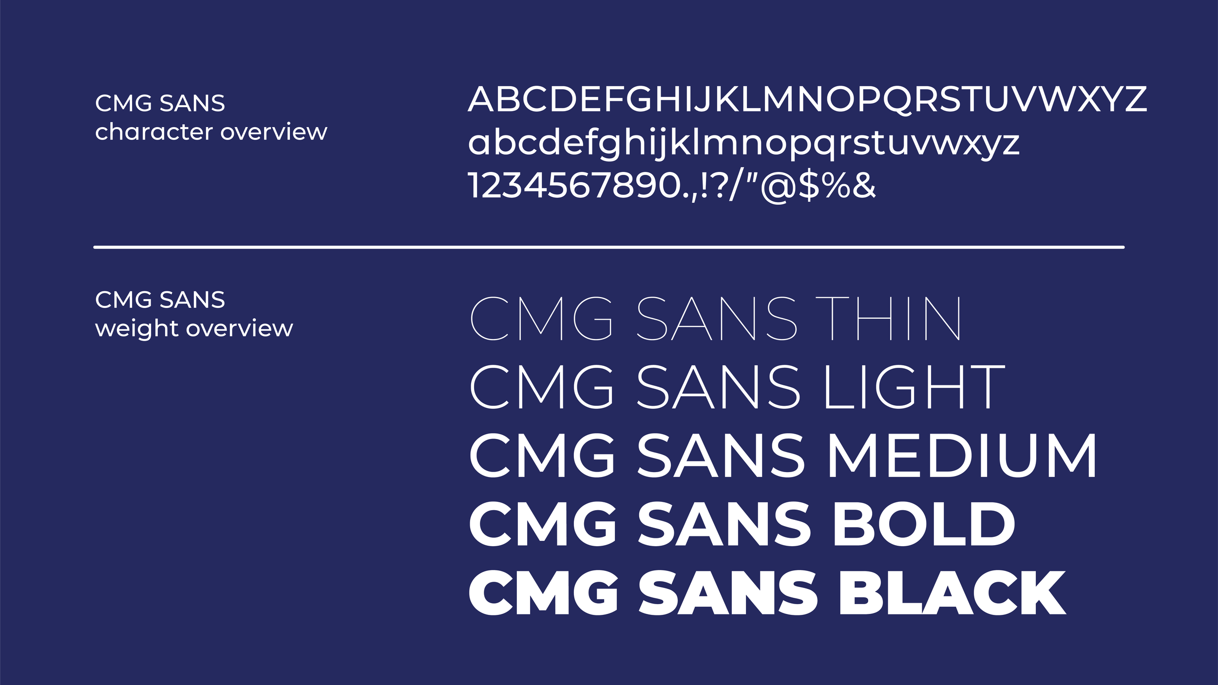
Typography
Considering the emergency nature of an urgent care and the fact that their clients are often in distress, I wanted to keep the typeface simple and straightforward - there is no room for confusion (or scripts) in an emergency. CMG Sans and Museo Slab both reflect this while pairing well together. Additionally, the variety of weights in each type family allows for important information to be relayed clearly.